
UX Audit - Health & Fitness Tracker
UX Audit - Health & Fitness Tracker
UX Audit - Health & Fitness Tracker
🏠 Issue #1 - Home Screen Redundancy

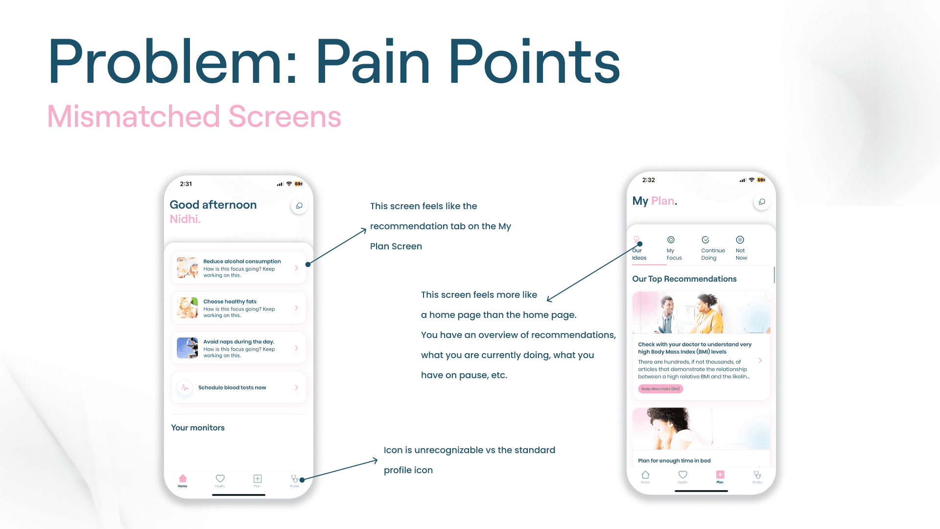
Home Screen & My Plan screens serve similar functions, having such similar pages is redundant
Home Screen feels like one of the recommendation tabs on the My Plan Screen
My Plan Screen feels more like a home page compared to the actual Home Screen due to all of the actual tabs
Miscellaneous critique, but the profile icon should use a more familiar icon to avoid confusing users


🧭 Issue #2 - Navigation

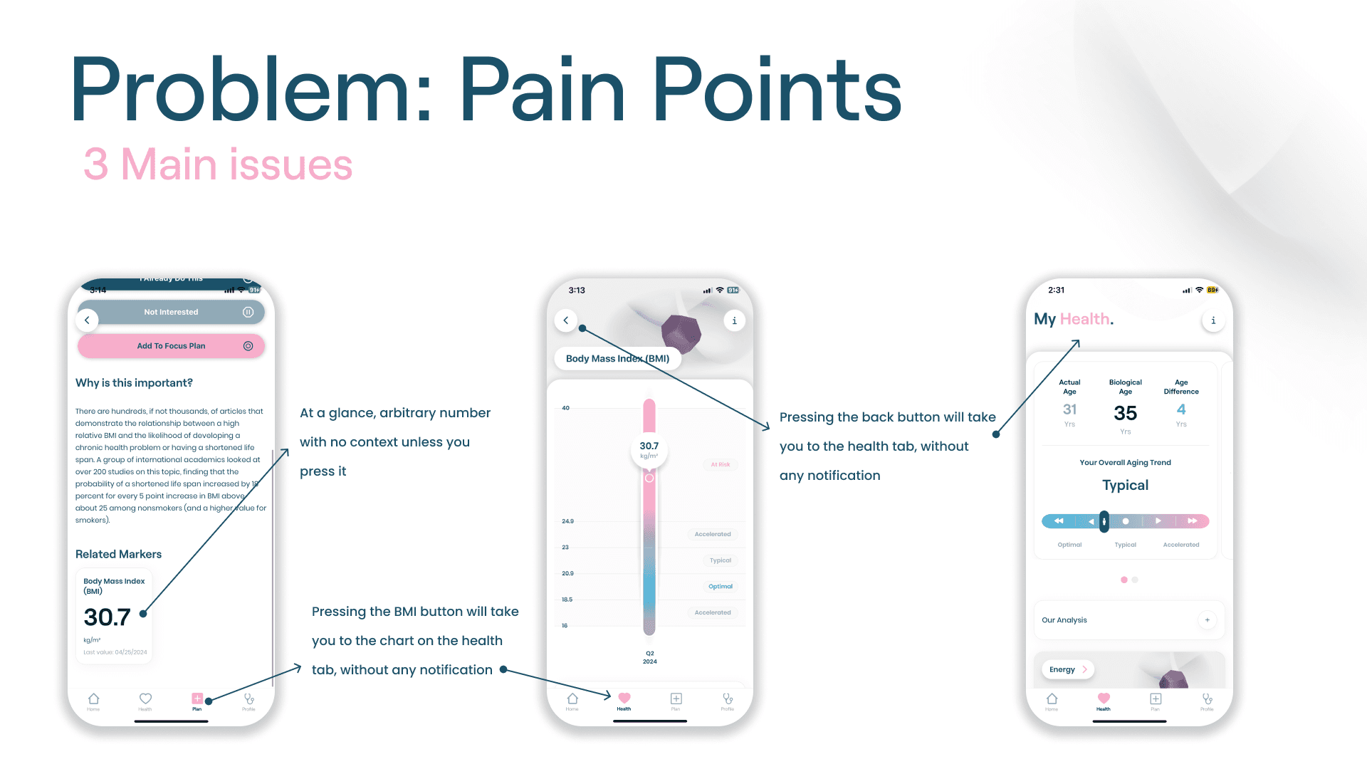
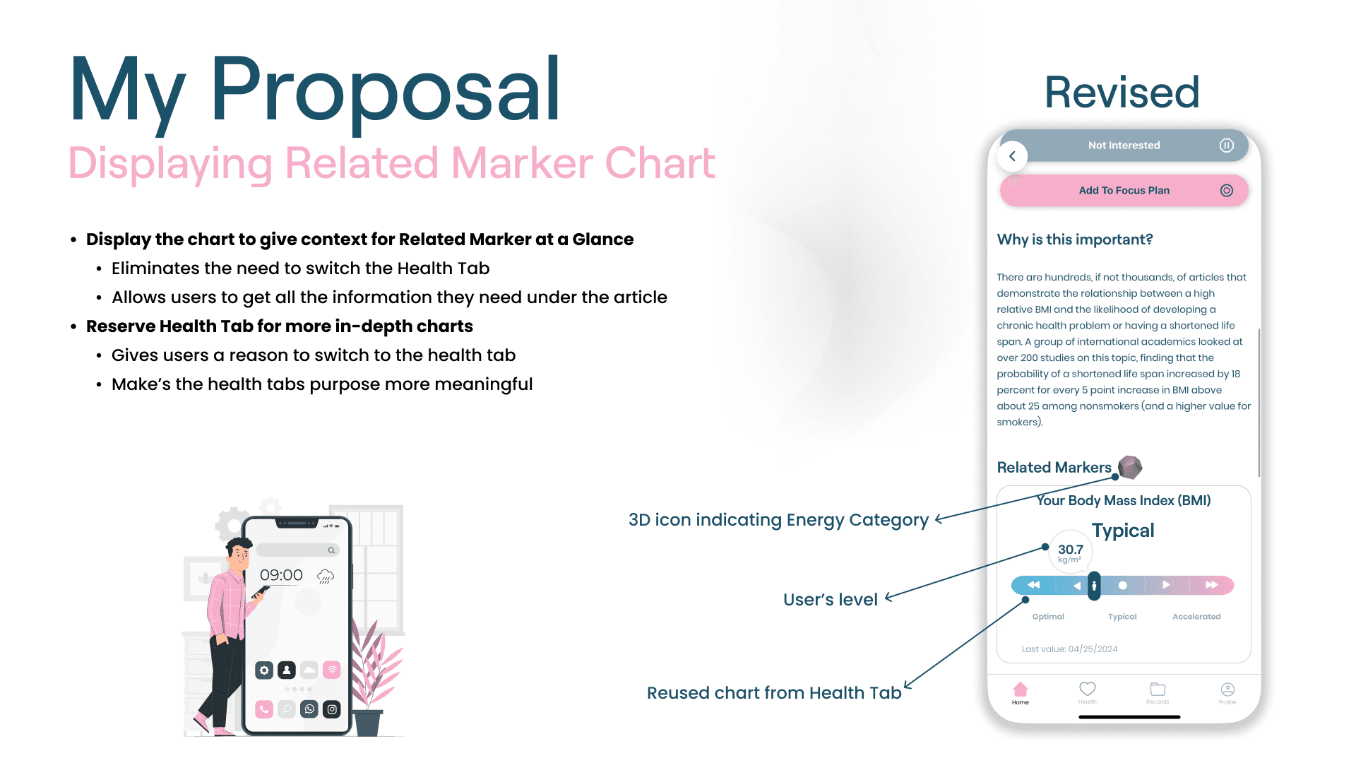
Related Markers feature is just an arbitrary number to the user at a glance
User must click on it for context
Displaying that feature here is counterintuitive since the user doesn't know what that number means
When pressing the Realted Marker feature, the user is taken to a Chart Page on the Health Tab without any notification
All actions a user takes within a tab must keep a user in a tab
When pressing the back button from the Chart Page, the user is taken to the default page for the Health Tab
Pressing a back button should always take the user to the page they were on before


🏠 Issue #1 - Home Screen Redundancy
Home Screen & My Plan screens serve similar functions, having such similar pages is redundant
Home Screen feels like one of the recommendation tabs on the My Plan Screen
My Plan Screen feels more like a home page compared to the actual Home Screen due to all of the actual tabs
Miscellaneous critique, but the profile icon should use a more familiar icon to avoid confusing users
🧭 Issue #2 - Navigation
Related Markers feature is just an arbitrary number to the user at a glance
User must click on it for context
Displaying that feature here is counterintuitive since the user doesn't know what that number means
When pressing the Realted Marker feature, the user is taken to a Chart Page on the Health Tab without any notification
All actions a user takes within a tab must keep a user in a tab
When pressing the back button from the Chart Page, the user is taken to the default page for the Health Tab
Pressing a back button should always take the user to the page they were on before